Charts
New in version 2.1.0.
As seen in the Configuration section, hcpcbc is able to create charts right after it downloaded new Chargeback reports.
For convenience, these charts are provided as Excel workbooks. This is a bit a drawback, as tools like mathplotlib would be better suited (and faster, as well). Unfortunately, mathplotlib doesn’t install well using pip, as it needs to be compiled locally under certain cicumstances. So the decision was made to stay with Excel workbooks.
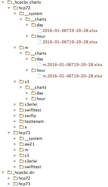
The output structure is quite close to the one used for the reports itself (in fact, they can overlay each other without interfering each other):
['4 charts']['2 path']/
    ['1 targets'][idx]['4 folder']/
        __system/
            __charts/
                day/
                hour/
        <tenant>/
            __charts/
                day/
                hour/
        <tenant>/
            __charts/
                day/
                hour/
The __system folder holds charts that compare the available Tenants against each other, whereas the tenant folder compare the Tenants own Namespaces.
As of the time of writing this, charts cover the entire timeframe for which reports are available.
Example:
Exemplary charts
Note
Example charts are not available in the PDF documentation - see the hcpcbc documentation online.
.png)